Artists & Illustrators: The Art of Keeping it Simple
As seen in…
Artists and two of tutors Liz Luckwell and Marion Taylor share their insights to achieving modernist minimalism in a modern time frame. Harness the powerful abstract potential of the still life, inspired by modernist icons William Scott and Ben Nicholson.
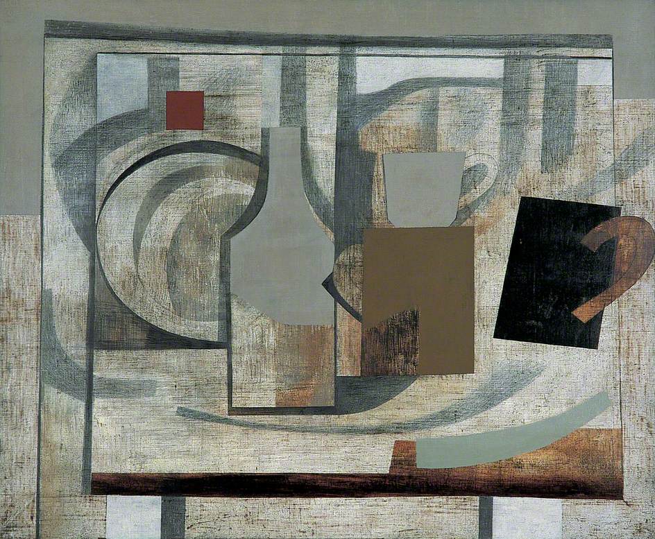
Though still resolutely abstract, these 1940s paintings had a domestic quality to them. The colours anchored the work to St Ives: chalky and putty planes layered up and scraped back. His combination of still life and landscape gives an enveloping sense of what it is like to sit in one of the studios looking out on Porthmeor Beach, a table of jugs or cups of tea in the window. These pared back surfaces and drawings took a long time to complete. Nicholson would paint a layer of oil paint and then leave it to dry, sometimes outside in the elements, then sand or scrape them back and paint another. It was a laborious process which Nicholson himself likened to watching his mother scrub the family kitchen table: an ordinary and essential act of devotion.
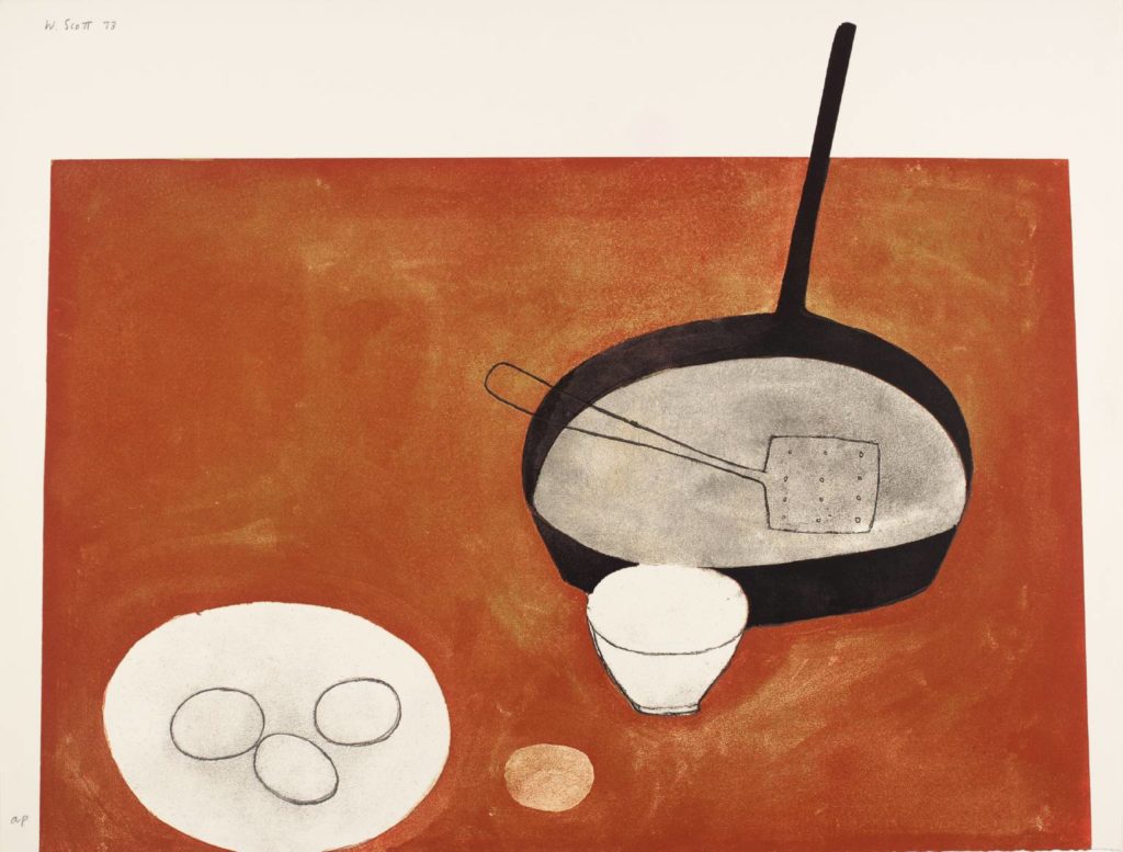
William Scott, on the other hand, was concerned with the domestic from his earliest days as an artist – painting from the objects that appeared readily in the ‘grey, austere world’ he describes growing up in. Again, his simplified forms were in fact the product of lengthy process, some of which was intentional reduction and obliteration and some just a matter of capitalising on happy accidents. The pans and eggs that were the recurring motifs of his work were valuable as shapes and lines, rather than subjects. By reducing them to pure form and function, objects that were once dreary and domestic transformed into something suggestive, even sensual.
Both painters were drawn to the spartan style that was emerging in St Ives in the early 20th Century, largely thanks to the naïve painter Alfred Wallis. Besides the
obvious attraction of the shimmering beaches and the thunderous rock formations of the coast, St Ives’ contemporary art tradition is as alive and relevant today as it was 100 years ago. We wanted to bring the history of reduction and abstraction to life right where it began, offering students the chance to work from the very same views that Ben Nicholson worked from when he established himself as one of the fathers of Modernism. It is a chance for people to feel part of the electric history and atmosphere that has produced some of the world’s greatest paintings.
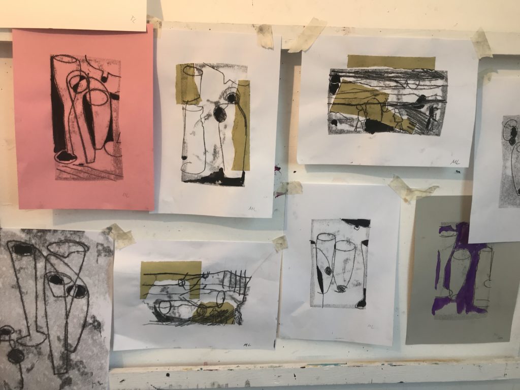
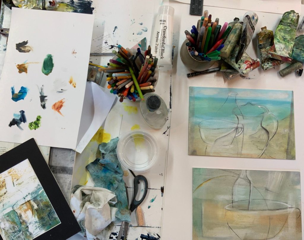
Monoprinting with Liz Luckwell
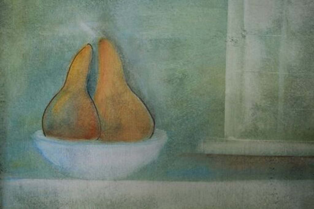
Begin by setting up a still life. The ‘props’ William Scott used for his still life were deliberately innocuous, he called them “the means of making a picture,” useful as shapes and lines rather than subjects. When setting up your own still life at home, this is a good rule to live by: overthinking the subject defeats the object. Select the plainest objects around you and let them tell their own truth about where you are coming from as an artist. You only need two or three objects – pears were a favourite of Scott and we often use them in the studio, or just plain white mugs.
Another rule of Modernist simplicity is the limited palette. If you can, use background colours that echo the colours in your subject. This will give your image a unified tone similar to Nicholson and Scott. Monoprinting is an ideal place to start when approaching your composition as it requires looking for the essential lines of your subject and doesn’t allow you to sketch or rub things out. You have to be loose and confident with your line.
You will need…
- A selection of ordinary objects for a still life composition.
- Pencil or graphite
- Ink roller
- Waterbased ink (we used Lawrence water washable relief printing ink)
- A palette or surface to use as an ink well
- An impermeable surface or plate such as acetate, glass or laminate
- Lightweight paper
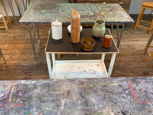
1 Set up a still life composition
Use a clear surface – a blank piece of paper or tablecloth is useful to focus the eye and define the outer shape of your objects. Make sure the area you’re working in is well lit, though some shadow works to introduce tone to your drawings and prints.
2 Preparatory drawings
Take your time with these, familiarising yourself with the key lines of the image. Start by just drawing the outer edge of the objects, keeping to a single line. Then begin to add more detail of the interior, noticing which lines are of particular significance to the image. Then begin to incorporate some tone, light and shade, using only the pressure of your pencil: press harder in as you take your line over darker areas, and more faintly in areas of light.
3 Prepare the ink
Squeeze a small amount of ink onto your ink well and dab the roller into it lightly, coating it evenly on all sides. Roll the ink out as thinly and evenly as possible onto your printing plate.
4 Make your print
Float the paper over the ink, taking great care not to touch it as this will create marks on your print. Using your pencil, draw your design onto the paper, using different intensities of line to suggest tone, as practiced above. The result will be a velvety line image with an immediate and naïve quality to it. Because the image comes out in reverse, this is a technique many artists use for finessing composition for a painting, as it shows immediately if the image is off balance.
Painting with Marion Taylor in Ben Nicholson’s 1940s style
People are drawn to Ben Nicholson’s style because it allows you to get to the essence of what you’re trying to paint. His drawing has a purity to it and the quality of his surfaces is so evocative. The shapes were sometimes geometric or architectural but still life was at the heart of his technique.
With the rise of Modernism, drawing became less about complex representation and more about condensing and simplifying things to their most essential nature. Nicholson had a collection of pots and jugs, inherited from his father – the admired painter Sir William Nicholson. Nicholson drew the vessels time and time again, clarifying them down to their main lines. The lines and curves he produced took on their own language, independent of the source. They were just beautifully drawn shapes. The scrubbed effect that emerged in his paintings in the 1940s and would become his signature was a result of reworking paintings, paring back and painting or drawing over earlier work.
You will need….
- Ordinary objects for a still life composition (as above).
- Acrylic primer (from a hardware store is ideal)
- Wooden board or thick card
- Oil paints (see below for colour suggestions)
- Low odour solvent
- An old rag, sponge or tea towel
- Pencil or graphite
1Prepare your surface
Much of the magic of Nicholson’s work comes from revealing the surface of what he’s working into – the weave of the canvas or the grain of the board. To allow the paint to be moved and removed readily and provide texture to your image, use an acrylic primer that gives the paint some slip. Leave the brush strokes slightly visible in places. Let this dry completely before painting your ground.
2 Select your colours for the ground
The painted ground should supply your work with a sense of place. When I teach this technique, I try to return to Ben Nicholson’s colours, which were basically about St Ives: stone and sea, sky and land. You can use any colours that are suggestive of a place or scene you’d like to evoke – I’d recommend using a limited palette comprising two colours, plus the earth colours and Payne’s Grey. (When you remove the pigment in step 5 the primer acts as your white.) Some of Nicholson’s colours are: Cerulean Blue, Sap Green, Payne’s Grey and the earth colours – Raw Umber, Raw Sienna, Burnt Sienna.
3 Apply Paint
Ben Nicholson was renowned for his precise nature: the technique of rubbing back oil paint allowed him to achieve a very clear vision that already existed in his head. However, for many student artists a reductive technique works as a relief from the pressure of the paintbrush. Applied with a rag or a sponge, I find people worry less and work faster. Using your fingers covered by a rag, dip into a little solvent, then into your paint and cover the ground very loosely. You won’t need too much solvent and you can use the surface to mix colours together.
4 Scrape Back The technique is as much about removing the paint as applying it, building up in thin layers to preserve a transparent glow almost akin to the glazing techniques used by the old masters. These techniques would again have been time consuming, waiting for each previous layer of oil paint to dry before adding another, but applied in this way, the acrylic primer gives the layered texture of brush strokes with the oil only sparingly used in layers to add colour and depth.
5Repeat As you’re working on a white primed surface, you can apply the colours directly to the board and then wipe them back to combine and reveal the under-painting, or right back to the white. In this way the colours mix in unexpected and interesting ways, sinking into the texture of the surface. Your image can be continually changed, meaning your approach is freer than with a brush and you can achieve your atmospheric ground.
6Finish with drawing Your paint is thinly layered so you are able to draw into it straight away. Draw onto your ground the practised images with graphite sticks, (like Nicholson) dipped in solvent to make them more intense when you’re ready. Or you can try Indian ink or even charcoal (which is readily removable). You can thicken some stretches of the line or fill in small negative spaces if your work is more abstract, as Nicholson often did. In this way, your finished image can be as figurative or abstract as you wish.
12/3/2020
Share on
Related Stories
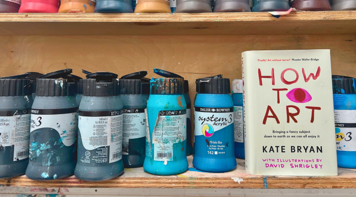
What You Can Learn From Kate Bryan’s 'How to Art'
At St Ives School of Painting, we’ve been welcoming artists of all levels since 1938 – from those who’ve studied for years to those discovering the joy of making art for the first time. That’s why Kate Bryan’s brilliant new book, How to Art, feels like such a kindred spirit to what we do. It’s...

Thinking Allowed with Alice Mumford
We invited artist and St Ives School of Painting tutor, Alice Mumford, onto a free interactive webinar where she grappled with some of the key burning questions for artists. Is Competition Good for Creativity? Discussion led by Alice Mumford Picasso and Braque forged a relationship that was part intimate friendship, part rivalry. The two artists...
In Conversation: Lesley Plumridge
We’re pleased to welcome artist Lesley Plumridge to our team of artist tutors for 2026. Based at the creative hub of Krowji in Redruth, Lesley is a mixed media designer and maker whose work thrives on experimentation, curiosity, and play. A graduate of Falmouth University (BA First Class Honours in Textile Design, 2005), her practice...