How to Create a Colour Beginning
As seen in…
A Fresh Start
JMW Turner expert Hilary Gibson reveals how ‘colour beginnings’ formed the basis of the artist’s greatest oil paintings and shows you how to create one at home.
During my career as an illustrator and art tutor, JMW Turner’s draughtsmanship and ‘colour beginnings’ have been a constant joy and inspiration. These layered washes of light-to-dark colours were fundamental to his paintings and have become a key feature in my courses based on the artist’s work.
I became a freelance illustrator in 1979 but, after years of creating artwork for storyboards, advertising and packaging, I longed to draw and paint what I wanted just for me. Like Turner, the urge to visit the west of England, to see the light and watch the huge red sun sinking into the sea over Porthmeor Beach, had to be fulfilled.
I finally arrived here in St Ives in 1994. Alongside my teaching and masters degree, I gave guided tours at Tate St Ives. One exhibition I particularly relished as a tour guide was 2006’s Light into Colour: Turner in the South West. I learned (and talked endlessly) about Turner’s visit to St Ives and Land’s End, recorded in sketches during the summer of 1811. Before the Great Western Railway opened up the Cornish Riviera to artists and tourists in 1859, Turner’s journey by horse-drawn carriage on rough terrain was not the simple five-hour train journey from London it is today.
Turner had made drawings and watercolours for engravings of the West Country on commission for William Bernard Cooke’s publication, Picturesque Views on the Southern Coast of England. Aimed at an emerging tourist industry, the first of 16 intended instalments was issued to subscribers in 1814, but the scheme was abandoned in 1826.
Turner gave Cornwall a Mediterranean sense of light and colour. He also revealed how the coast was being prepared for Napoleonic invasion and showed how people worked the sea and land and illustrated Cornwall’s industries. We think we can trust Turner’s realism but he did not merely copy nature in a topographical way; he often combined multi-viewpoints, while working creatively and imaginatively. Turner embraced new technologies and ideas, particularly Goethe’s colour theory, published in 1810 – with the notion of colour perception; prismatic colours arising from the interaction of light and dark coloured shadows and aberration.
Turner’s images of Cornwall were perhaps inspired by his first continental tour in 1802 to France and Switzerland, during which time he had studied paintings in the Louvre, Paris. He also toured Italy three times and, having travelled widely, it is hardly surprising that his paintings illustrated new developments in transport.
Few things are as scary to an artist as the blank canvas…
– Hilary Jean Gibson
A colour beginning is a useful technique to counter this.
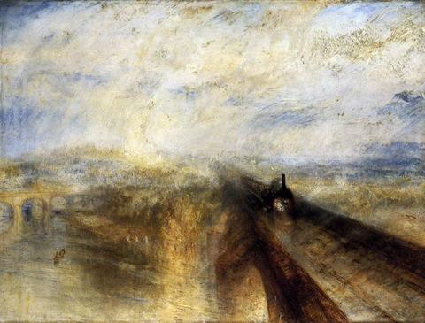
The artist famously travelled on the Gooch ‘Firefly’ 2-2-2, his head out of the carriage window at an exhilarating and then-unprecedented speed of 50 miles an hour. 1844’s Rain, Steam and Speed combines the force of the elements with the excitement and awe of industrialisation, as the GWR train throttles towards us over the Thames on Isambard Kingdom Brunel’s Maidenhead railway bridge. Visibly underlying this powerful oil painting is a ‘colour beginning’, a technique the artist adapted from his watercolour method.
Turner liked to work contre-jour – or ‘against daylight’ – often convincingly moving the light source and composing coloured shadows. Light falling on water would both reflect and refract, just as he read in Izaak Walton’s The Compleat Angler and observed whilst patiently waiting to catch a fish – the artist was after all a keen angler. With this in mind and combined with his new-found knowledge of Goethe’s colour theory, it is easy to imagine how Turner came to use ‘colour beginnings’.
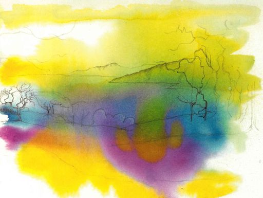
Few things are as scary to an artist as the blank canvas or a pristine white sheet of expensive watercolour paper. A Turner-style ‘colour beginning’ is a useful technique to adopt to counter this.
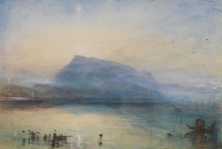
The artist used a combination of his acute visual memory and direct observational sketches in his hundreds of sketchbooks from early tours to create each colour beginning. 1844’s The Blue Rigi is a good example of this. The fluid an expressive quality of the colour beginning, translucent and delicate, underpins the painting with minimal darker tones and hues.
As blue-violets recede into the distance, the warmer reds, oranges and yellows envelope the sky and foreground. (Yellows dominated Turner’s paintings, which earned him the nickname of the ‘yellow dwarf’ at the Royal Academy).
This reveals years of experience and understanding of landscape, while also underlining the importance of sketchbooks created en plein air as an invaluable visual diary and future treasure trove.
As Turner did, you can apply imagination to a scene, but the simplicity of the colour beginning will help you to create the sensation of light in a painting.
How to create A ‘Colour Beginning’
You will need…
- A3 sheet of 300gsm watercolour paper
- A pot of water
- A mixing palette
- A size 14 watercolour brush
- A selection of artists’ quality watercolours
- 2B pencil
- Kitchen roll or tissue.
To create your own ‘colour beginning’, just as Turner did, you will need to work rapidly onto good-quality watercolour paper. Choose a plein air landscape or seascape subject for this and remember you are trying to reproduce the impression of light so work contre-jour – facing into the light.
If you want to be authentic, you can follow Turner’s palette, which might have included Rose Madder, Vermillion, Cobalt Blue, Ultramarine, Prussian Blue, Indigo, Lemon Yellow, Yellow Ochre, Naples Yellow and Viridian. The colour beginning can then be used as an abstract basis for a more detailed painting of a scene; its random colour arrangements offering happy accidents to which you can respond in paint.
1 Before you begin, you can draw a faint outline of your chosen subject with a 2B pencil if you’d like, but otherwise you can just work directly with brush and paint. Next, mix the required pigments with a little water to create very light mixtures on your palette. Dampen the paper with clear water first an apply to colour mixes using a large clean watercolour brush, starting with the lightest hues first.
2 Apply a wash of pale yellow merging it with other pure primaries in a swirling vortex of prismatic colours. Encourage them to run and create a rainbow effect. Lift off some of the colour with kitchen roll or tissue to introduce a passage of light. Add more water with your brush to disperse the pigment if it appears too strong.
3 When this is dry, it is time to add glazes – or washes of colour – to build up the vibrancy and intensity, superimposing washes and tones where necessary and allowing the translucent underpainting to show through. You could start to establish a sense of distance by using cooler blues and violets near the horizon and warmer yellows, oranges and reds in the foreground.
4 Finally add shadows and fine details minimally in mass tones using watercolour, gouache, or even dip pen with ink. This entire, four-step process could also be used to create a colour beginning on a canvas with dilute oils or acrylics in place of watercolour.
14/8/2024
Share on
Related Stories
Joan Eardley (1921–1963)
Joan Eardley remains an evocative and powerful figure in twentieth-century British art. Though born in England, she made her name in Scotland, capturing the grit of post-war Glasgow children and the elemental force of the Scottish coast. Her work is deeply rooted in place, people, and landscape – three intertwined strands that shaped her life...
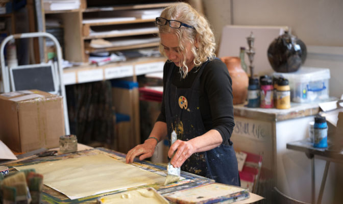
In Conversation: Meg, Studio Manager
At the heart of the studio is Meg, our Studio Manager, whose role weaves together organisation, creativity, and care. We caught up with her to hear more about her day-to-day, her own artistic practice, and what makes the studio such a special place to be. Meg, Studio Manager Life in the Studio First thing on...
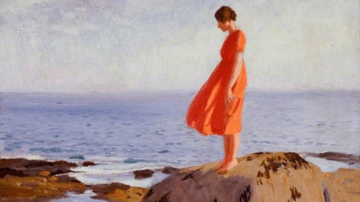
Dame Laura Knight: 'A Dark Pool'
Few artists captured the vitality of early 20th-century Britain quite like Dame Laura Knight. Known for her luminous palette, bold compositions, and commitment to painting the world around her, Knight carved out a space for herself in a male-dominated art world, and in doing so, redefined what it meant to be a modern British artist....